
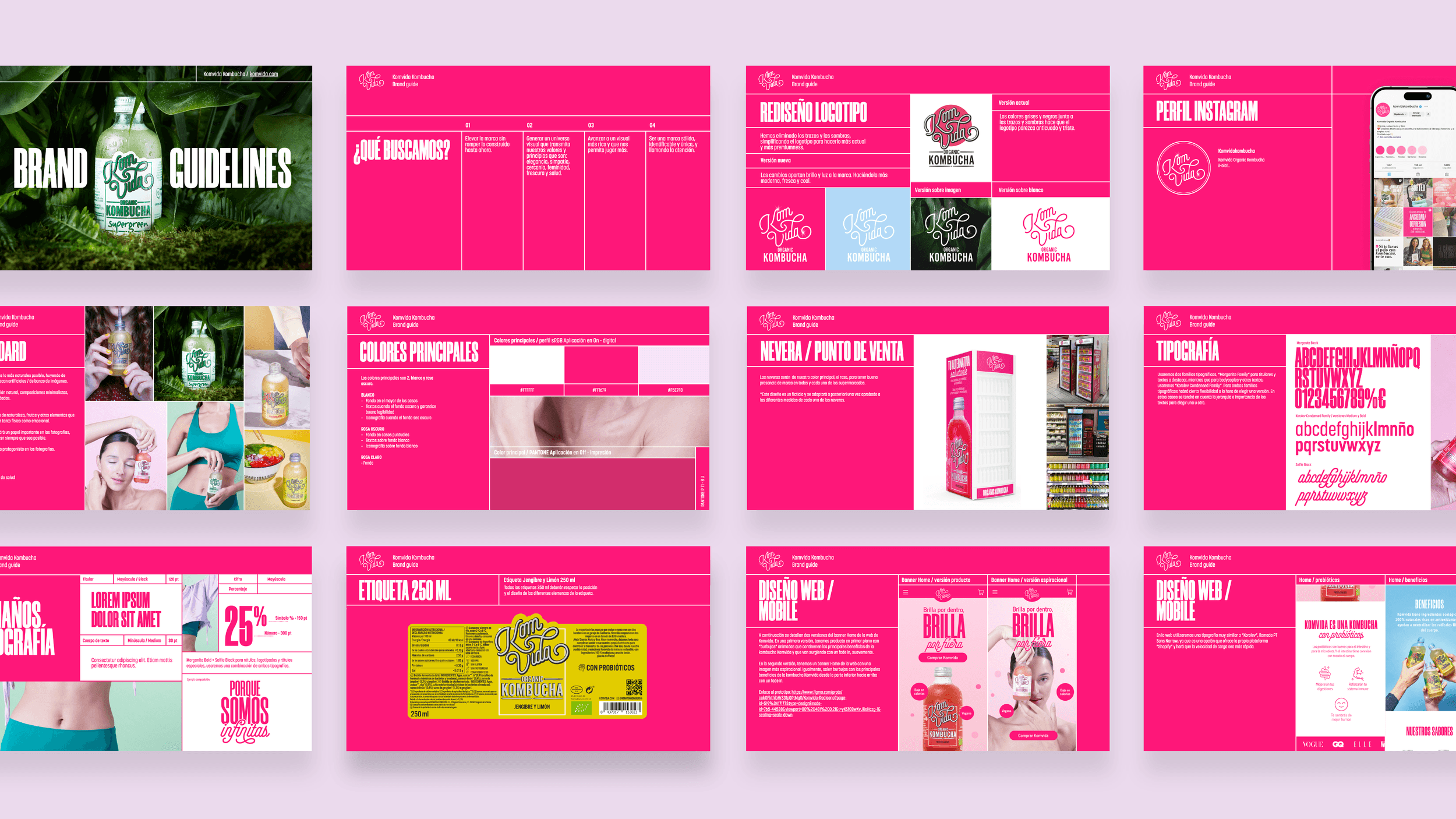
Rebrand an existing company to showcase their values, humble beginnings, their innovation within the European beverage market and current relevance through modern design.
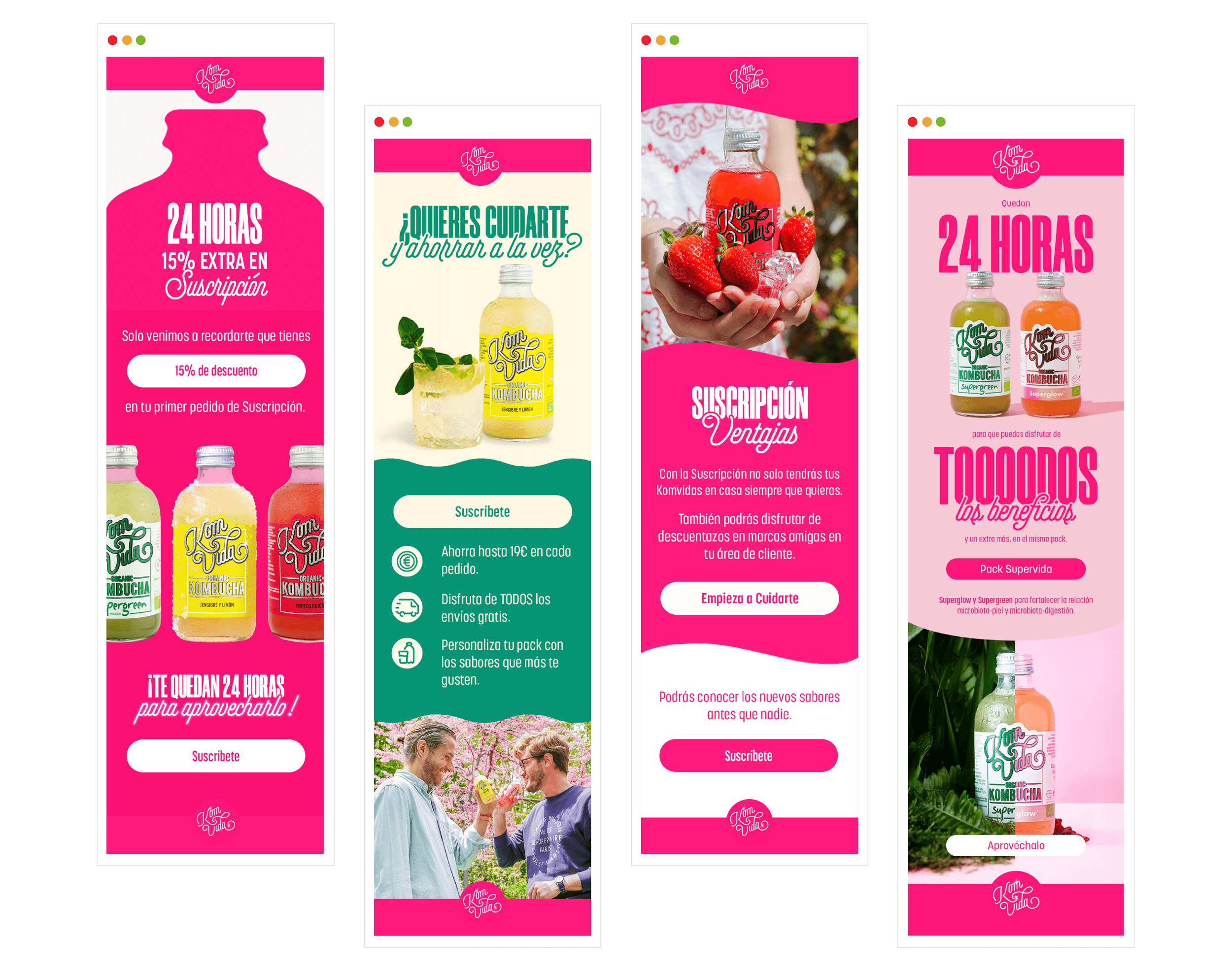
Created by Bea and Nuria, Komvida Kombucha is the healthy alternative to soft drinks ideal for any time of the day. With a fresh yet strong, fuchsia pink look, this brand is expanding their girl-empowering, entrepreneurial influence around Spain via their eye-candy graphics, inviting adverbs and interactive social media post.

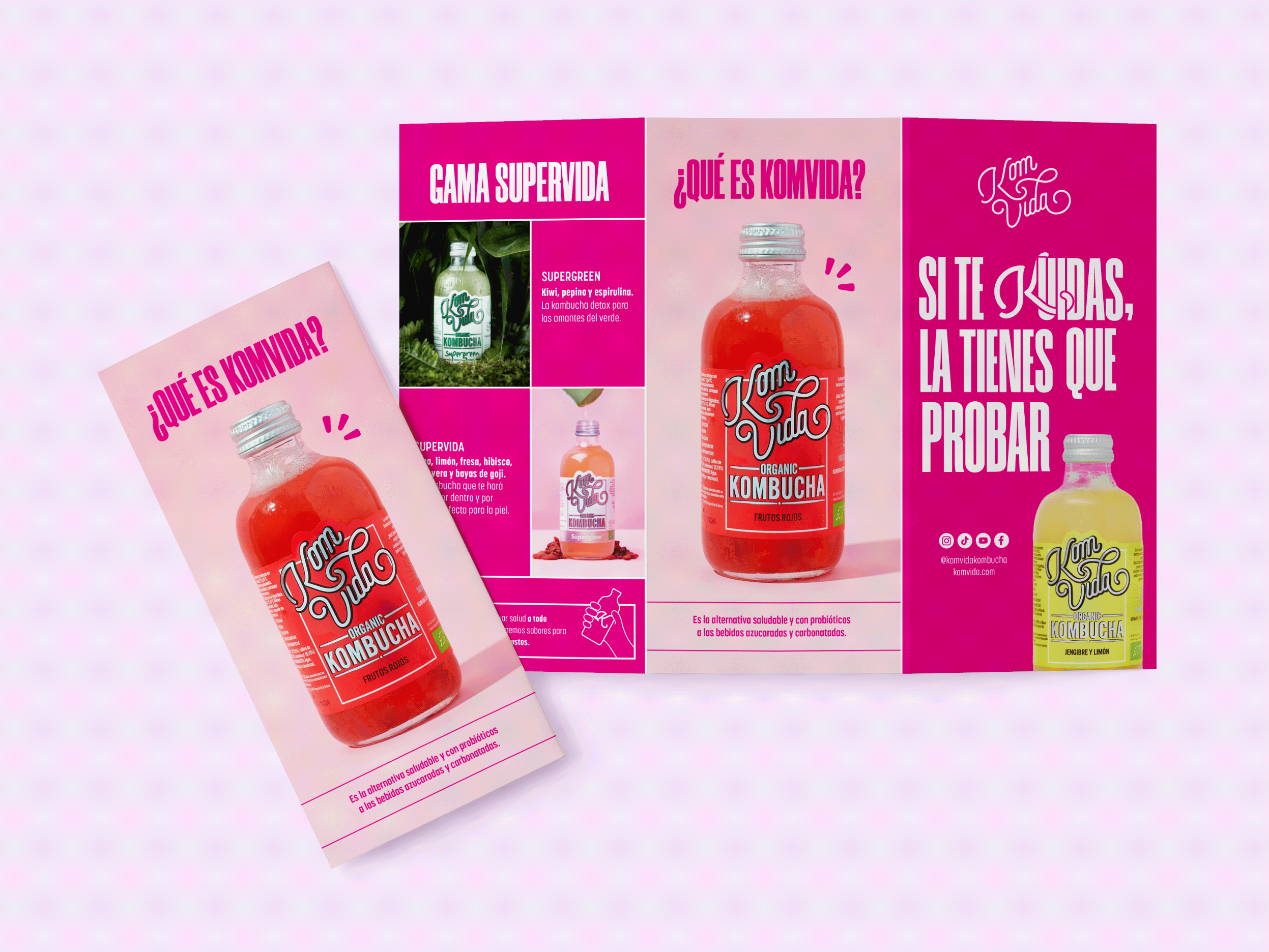
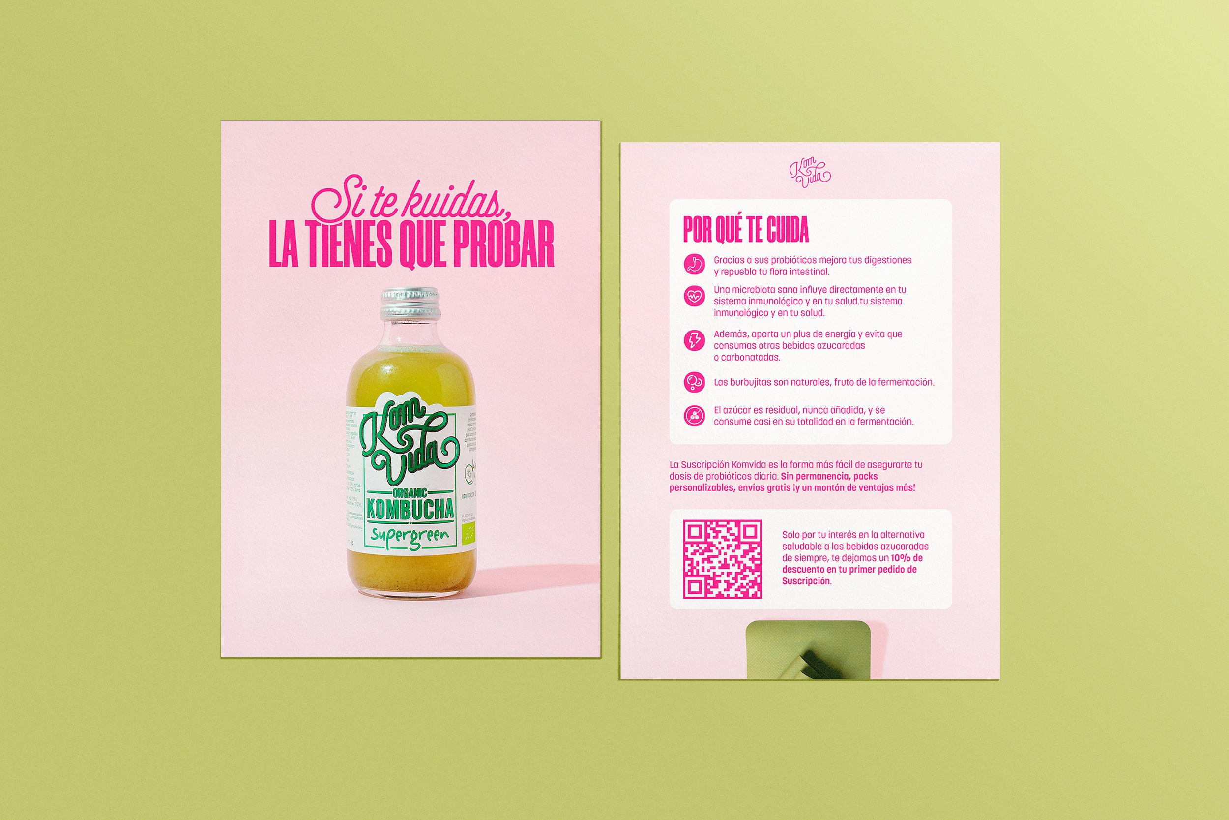
Komvida kombucha es una bebida refrescante, ecológica, con probióticos y baja en calorías. Fruto de esa fermentación y al no estar pasteurizada se consiguen los probióticos, que tienen beneficios sobre la salud.
Komvida kombucha is a refreshing, eco-friendly, probiotic-infused and low-calorie drink. As a result of this fermentation and as it is not pasteurized, probiotics are obtained, which have health benefits.
KOMBUCHA + VIDA ("LIFE" IN SPANISH) = KOMVIDA
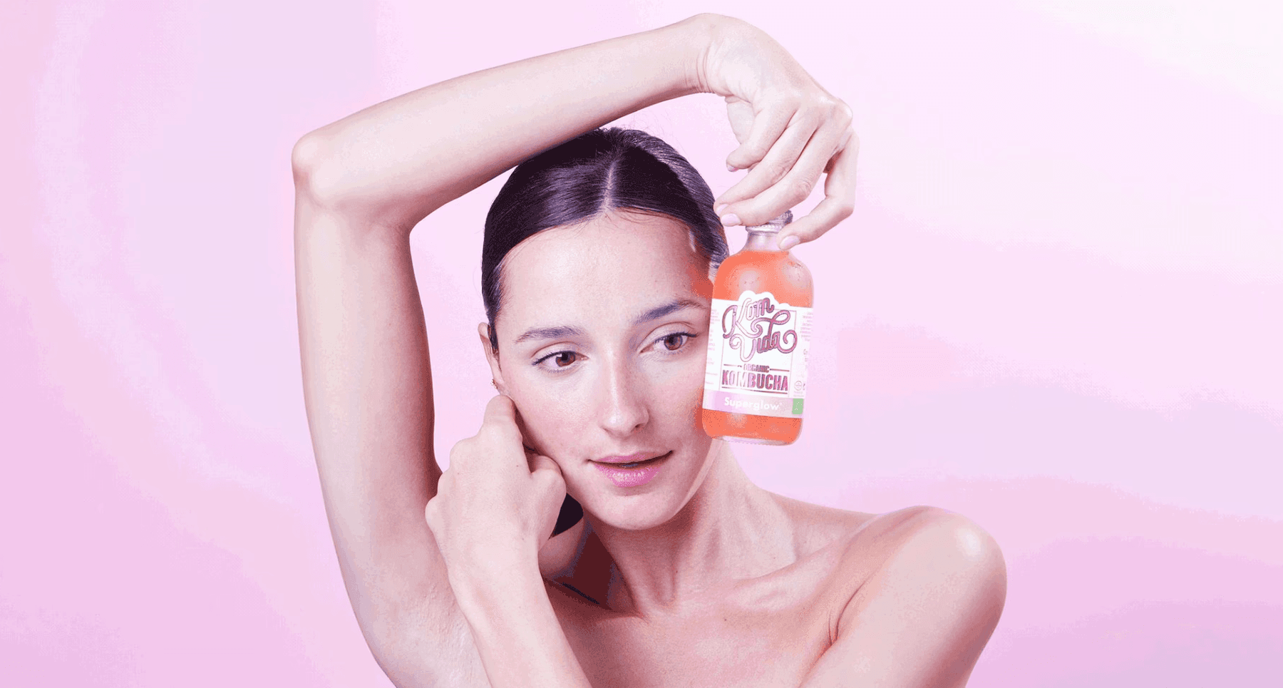
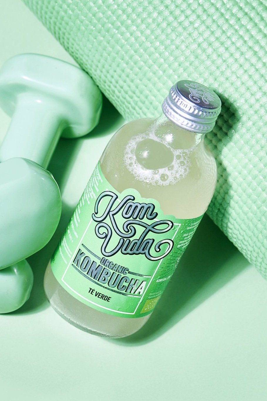
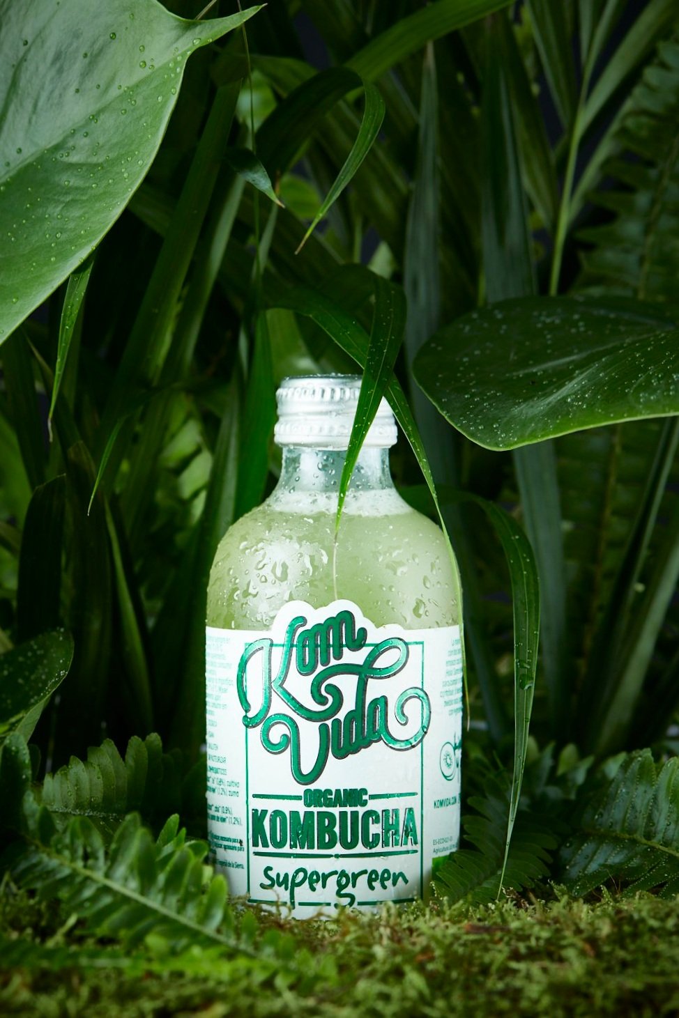
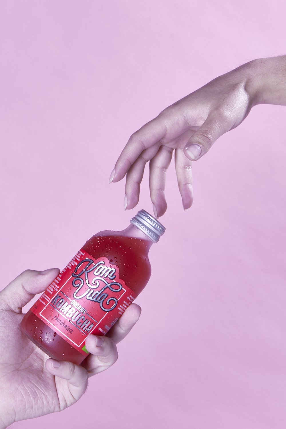
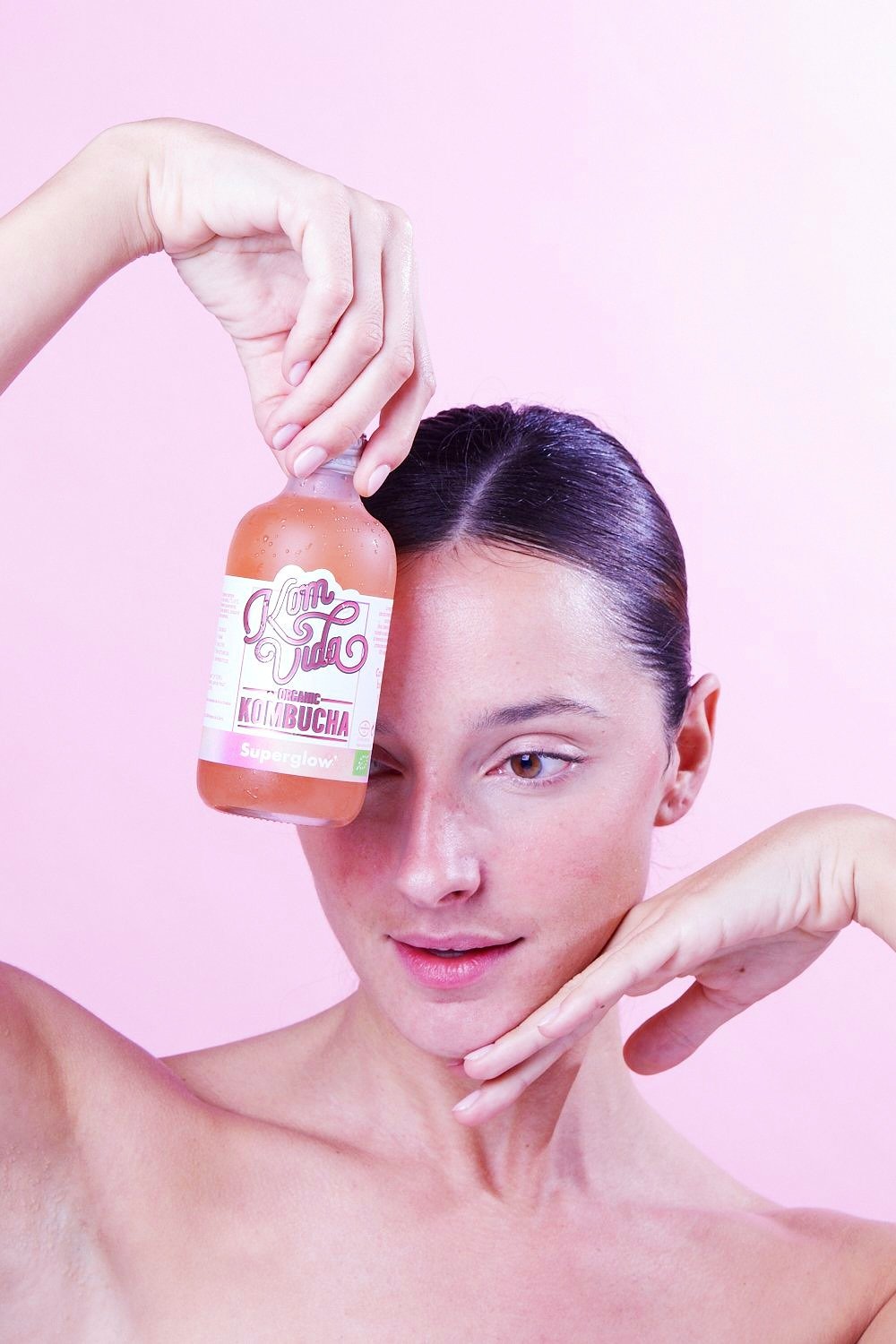
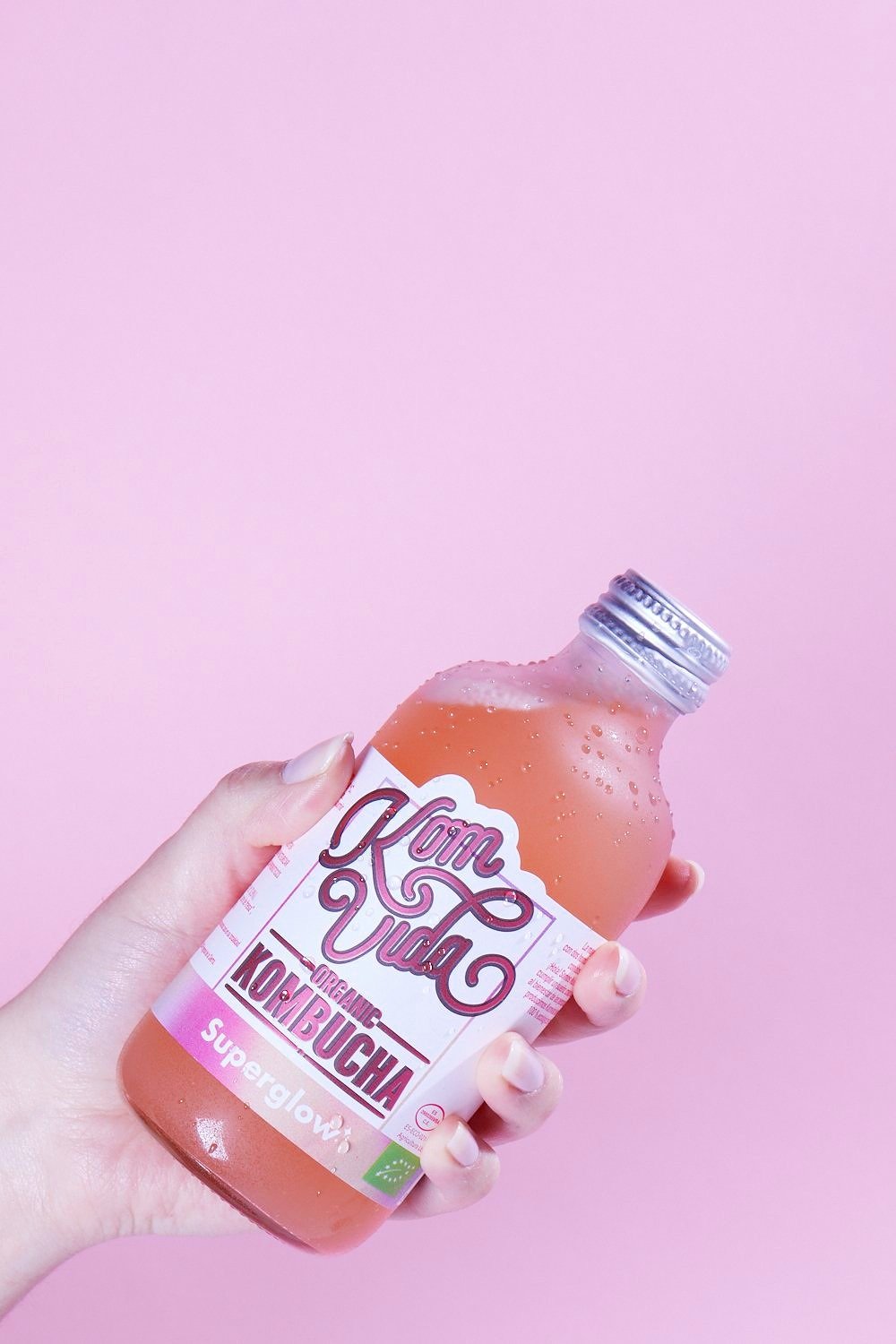
During the beginning of my internship, I was responsible with organizing, propping and staging the official Komvida Kombucha re-branding photoshoot. With the help of the company’s senior art director, Andrés Gils, we were able to come to common grounds with the photos compositions, lighting and showcasing of the brand.
Fun Fact: I was one of the hand models for the company’s newest flavor at the time! How about that ツ
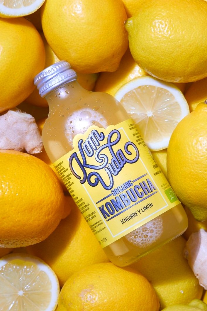

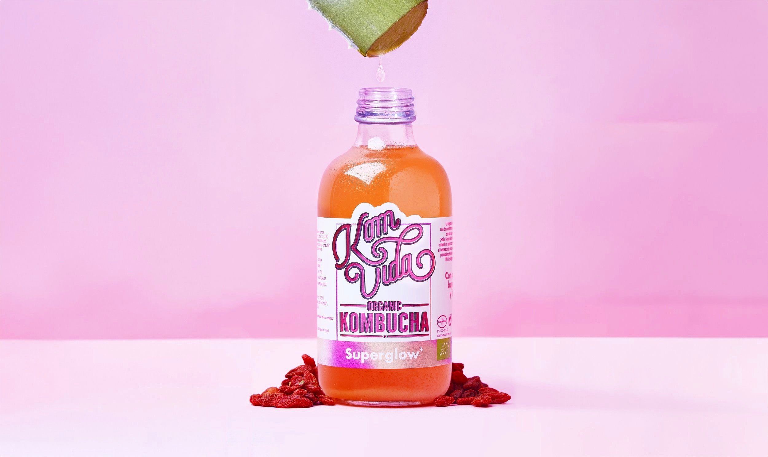
Me (top right).
Not me.
Also me.
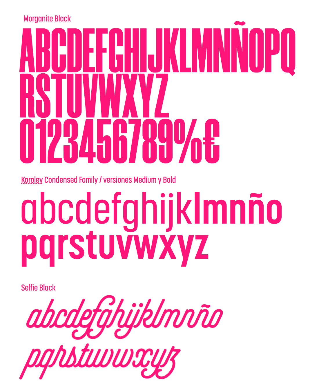
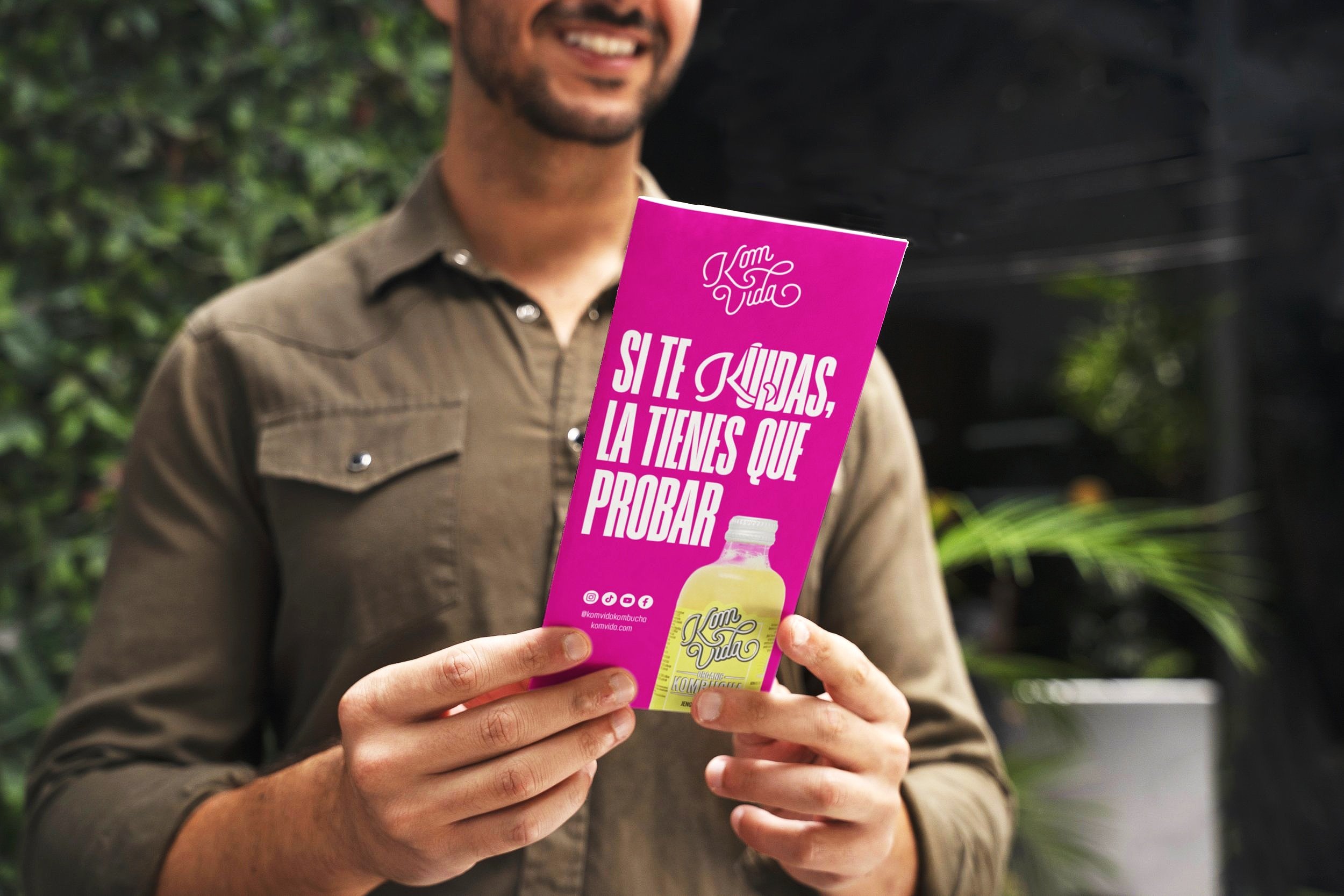
From creating the company’s brand guidelines and to their advertising prints, the team and I collaborated towards creating digitals and prints that accurately Komvida’s personal expression, as well as they’re branding strategy.
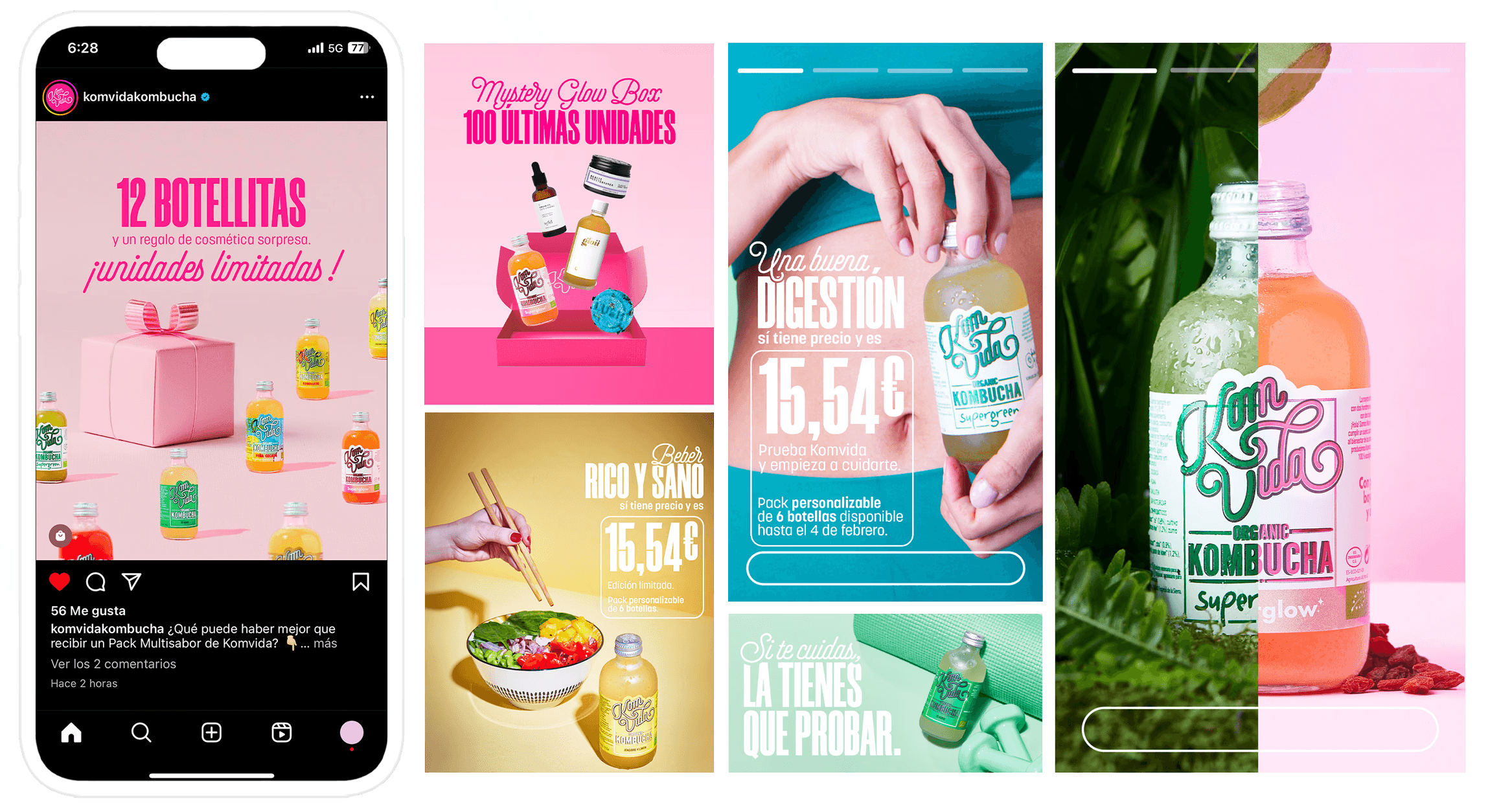
And of course in this day and age of technology, we were finally tasked with creating social media stills and motion graphics to elevate the voice and visability of Komvida Kombucha. These post ranged promos and mystery boxes to UGC teaser and interactive content.
Art Direction: Sarah-Marie Sosa & Andrés Gil
Copy: Lusia Corral
WANNA SEE MORE?